 Go Back
a lead & quotation management dashboard
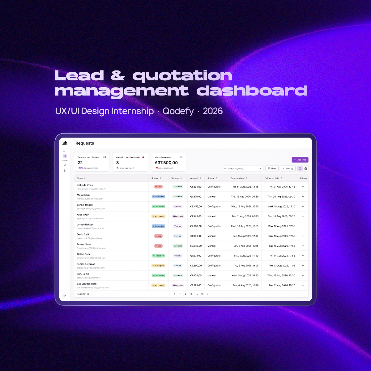
Lead & Quotation Management Dashboard
Designing a clearer way for service businesses to manage leads, quotations and follow-ups.
During my UX/UI internship at Qodefy, I worked on the design of a lead and quotation management dashboard. The goal was to create one central place where service businesses can manage incoming leads, prepare quotations, track their progress and know when follow-up is needed.
Role: UX/UI Designer
Company: Qodefy
Project: Internship Project
Focus: UX Research, Interaction Design, Prototyping, User Testing & UI Design
The challenge
Many smaller service businesses receive leads through several different channels such as WhatsApp, phone calls, websites, configurators and referrals.
The problem is that the information does not always end up in one place.
During the project, I found that businesses were using a combination of WhatsApp conversations, paper notes, spreadsheets and memory to keep track of potential customers. Quotations were often calculated manually and follow-ups depended largely on the business owner remembering to contact someone.
The challenge became:
How can we make managing leads and quotations simple enough for daily use, while still giving businesses the overview they need to keep opportunities from being forgotten?
Understanding the workflow
Before designing the dashboard, I interviewed people working in service businesses to understand how they currently handle new customer requests.
Rather than immediately asking what features they wanted, I focused on understanding how a lead moves from the first customer contact to an accepted or rejected quotation.
A few recurring problems became clear:
• Leads arrive through many different channels.
• Customer information is stored in different places.
• Quotations often require manual calculations.
• It can be difficult to see which leads still require attention.
• Follow-ups
are easy to forget.
• Existing systems can feel too complicated for smaller businesses.
This changed the direction of the project. The dashboard didn't need to become a large CRM with as many features as possible. It needed to make the core workflow fast, clear and easy to maintain.
From research to a design direction
One of the most important decisions was how leads should be presented.
A Kanban board is useful for understanding where leads are in the sales process, but a table is much better when users need to quickly compare customer information, dates, quotation values and follow-up information.
Instead of choosing one of them, I designed the dashboard around a hybrid pipeline-first approach.
Users can switch between a structured table view and a visual Kanban view depending on what they are trying to accomplish.
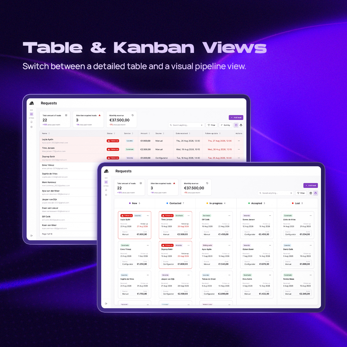
This became the foundation of the final product.
Testing and iteration
I first developed the structure as a mid-fidelity prototype and used think-aloud testing to see whether users understood the dashboard without additional explanation.
One important finding was that leads requiring follow-up were not noticeable enough.
In the first version, this was communicated mainly through a small warning icon. Users could technically see the information, but it was too easy to overlook while scanning the table.
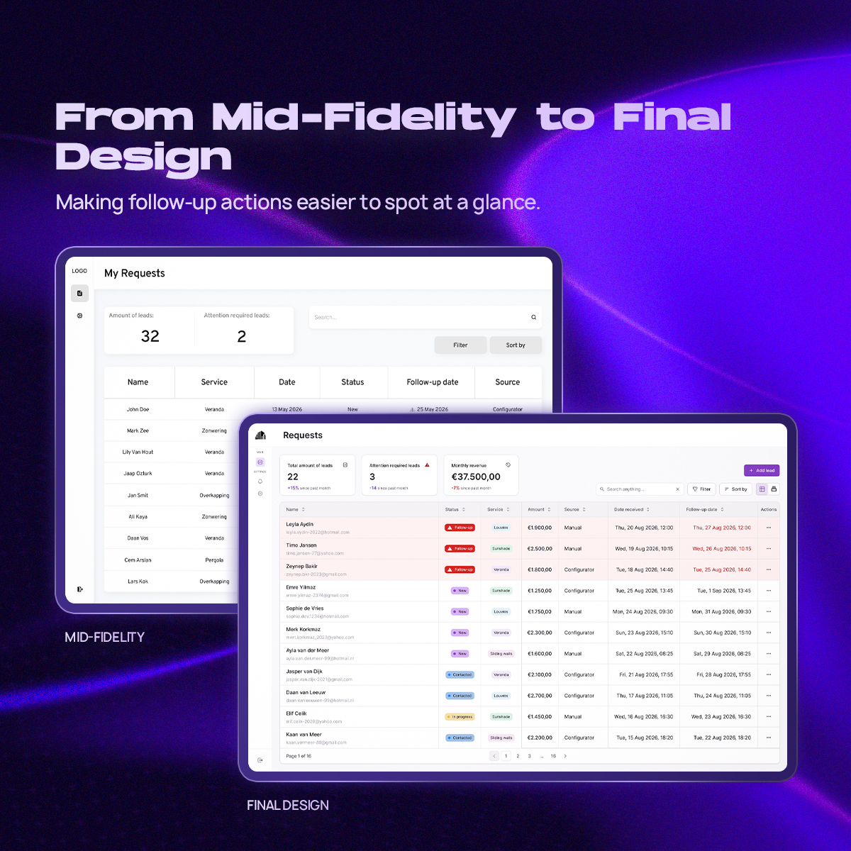
In the final design, overdue and attention-required states became much more visually prominent through clearer status indicators, highlighted information and stronger hierarchy.
This was an important lesson throughout the project: information being present does not automatically mean that it is noticeable.
The final experience
Managing leads at a glance
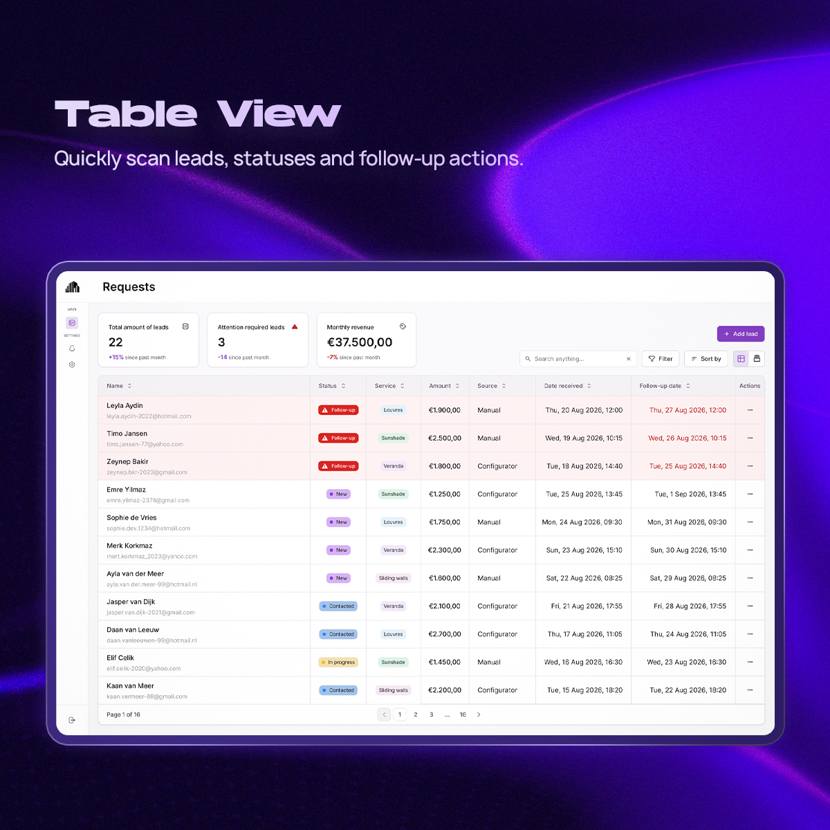
The table view is designed for quickly scanning and comparing leads.
Important information such as the customer, status, received date, quotation value and required actions can be viewed without opening each lead individually.
Search, filtering and sorting help users work with larger amounts of leads, while attention states make it easier to identify which opportunities require action.
A visual sales pipeline
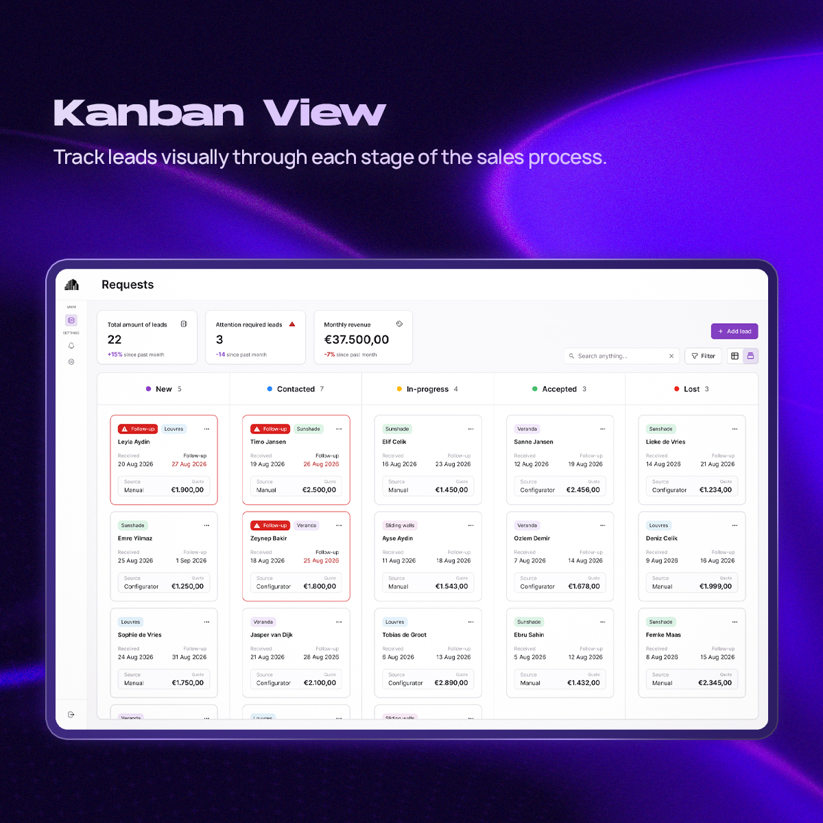
The Kanban view provides a different perspective on the same information.
Instead of focusing on individual data points, it allows users to see how leads are distributed throughout the sales process and quickly understand the state of the pipeline.
Because both views use the same underlying leads, users can switch between them based on the task they are performing.
Adding a new lead
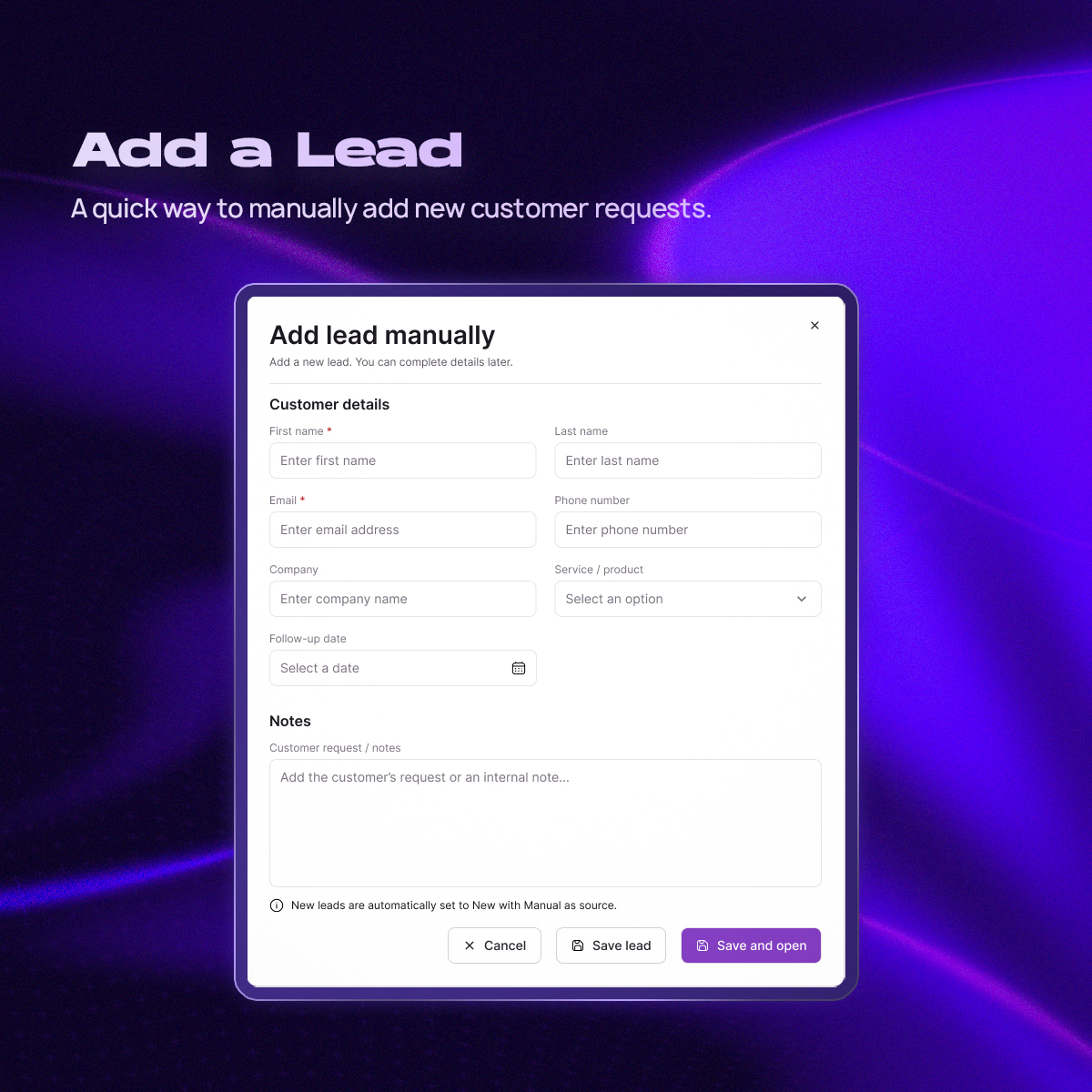
New leads can also be added manually when a request comes in through channels such as a phone call, WhatsApp conversation or referral.
I kept this interaction intentionally lightweight.
The goal was to collect enough information to create a usable lead without turning a quick administrative action into a long form.
Lead details
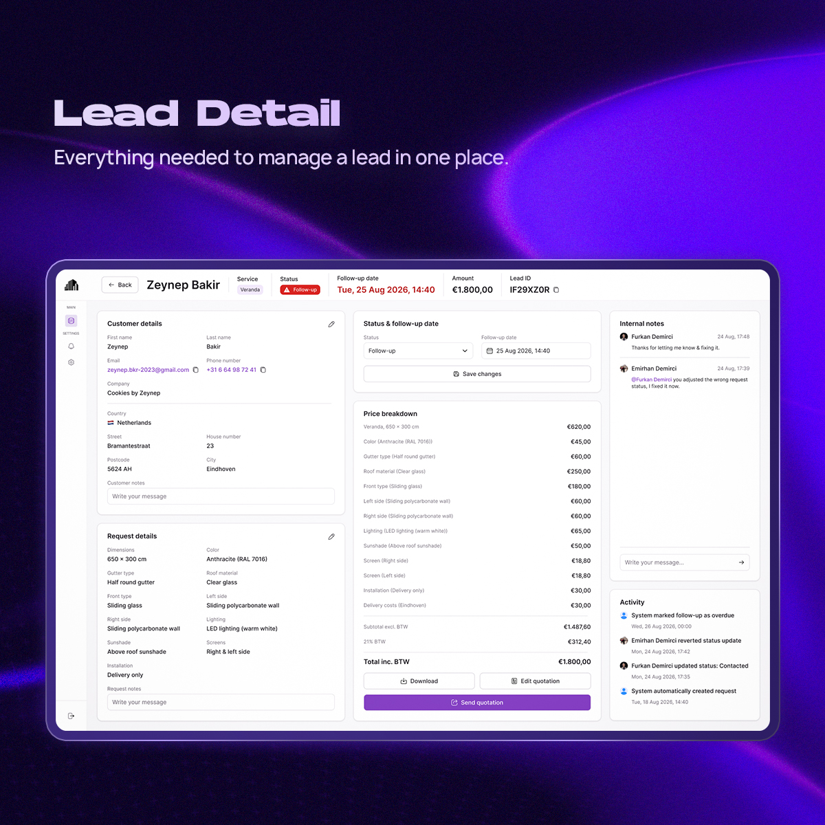
The lead detail page brings all information about an opportunity together.
Customer details, notes, status and quotation information are placed in a structured overview so users do not have to search through different conversations or documents to understand what happened with a lead.
Actions that change the state of the lead remain easily accessible.
Creating and editing quotations
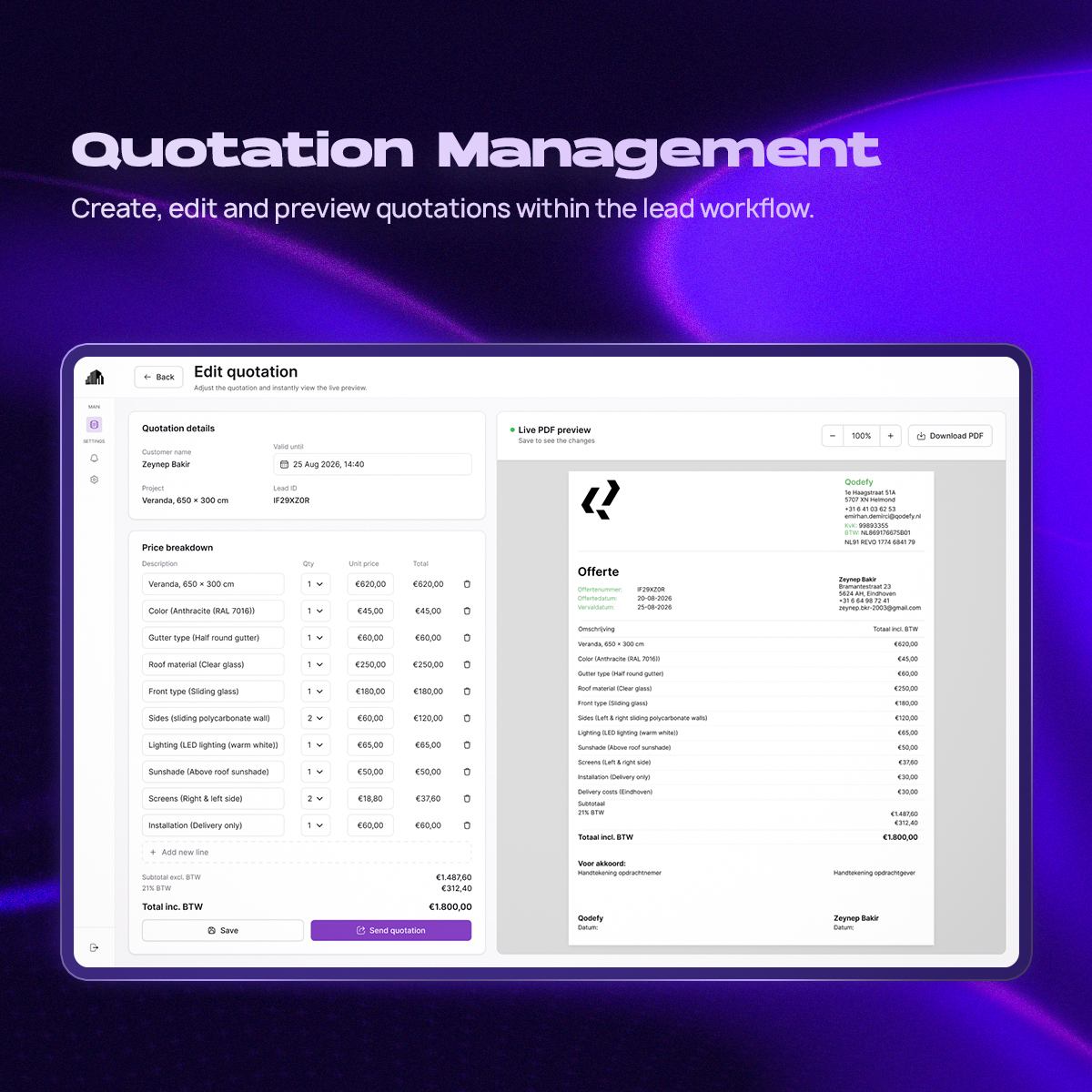
Quotation management is connected directly to the lead instead of functioning as a separate workflow.
This makes it possible to move from customer information to pricing and quotation details without losing context.
The interface was designed to support the calculations needed for a quotation while keeping the process understandable for users who may not work with CRM software every day.
Building a consistent interface
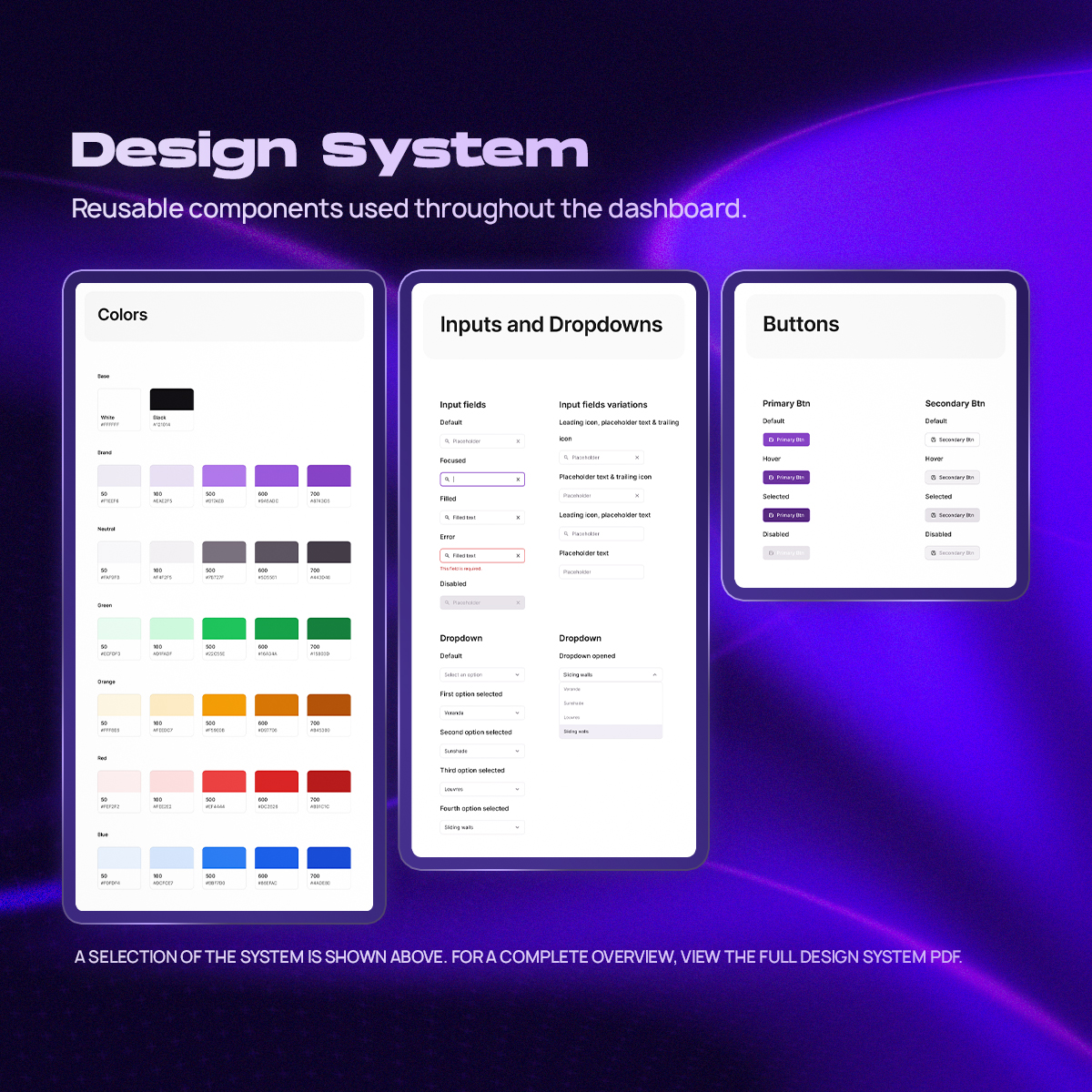
Alongside the final screens, I created a reusable UI system covering elements such as buttons, status indicators, form fields, cards, navigation and table components.
Creating these components helped keep interactions and visual hierarchy consistent throughout the dashboard and made it easier to expand the product with additional screens.
See full design system PDF
Outcome
The final concept brings a fragmented lead-management workflow into one central experience.
Instead of relying on WhatsApp conversations, notes, spreadsheets and memory, users have a structured overview of their leads, quotations and required follow-ups.
More importantly, the final solution was not based only on assumptions. The structure evolved from user interviews, prototype testing and multiple design iterations throughout the internship.
What I learned
This project gave me the opportunity to work on a UX/UI problem within a real company rather than designing only from a predefined assignment.
The biggest lesson for me was learning when not to add functionality.
It was easy to imagine a dashboard filled with CRM features, analytics and automation. However, the research continuously pointed back to simplicity, overview and speed as the most important qualities for the users I was designing for.
I also became more conscious of the difference between designing information that is technically available and designing information that users actually notice. Testing the prototype helped uncover issues that would have been difficult to identify by looking at the design alone.
If I continued developing the product, I would explore features such as team ownership, conversion insights and lost-lead analysis once enough real usage data became available.