A self-initiated mobile app concept for Cardmarket, the marketplace where collectors buy and sell trading cards. The goal: make searching, comparing prices and saving cards quicker on a phone.
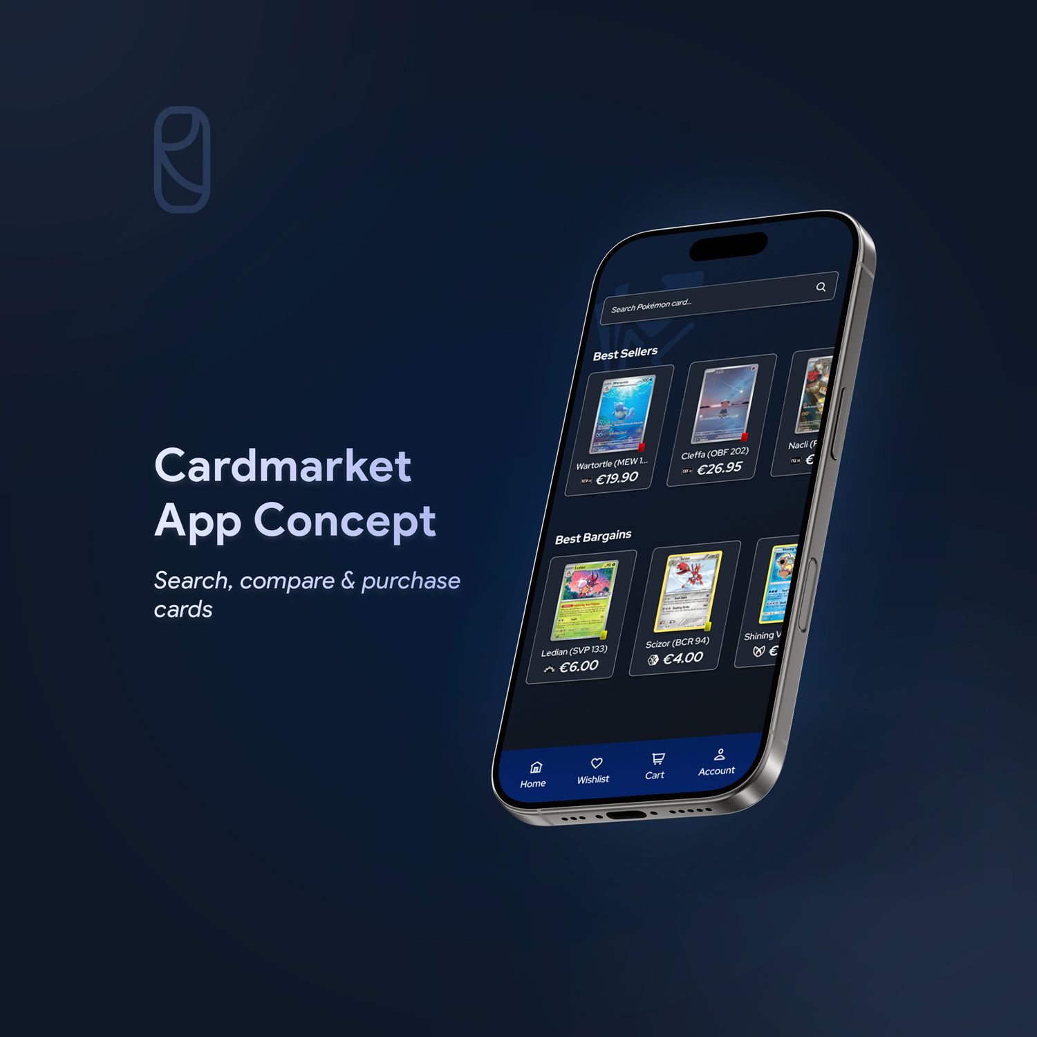
Why Cardmarket
Cardmarket is a peer-to-peer marketplace for trading cards: collectors buy directly from each other, with secure transactions and seller reviews. Buyers and sellers are all based in Europe, which makes it the go-to platform for European collectors.
I started collecting Pokémon cards again and quickly used Cardmarket almost daily. Along the way I noticed a lot of things that could work better. After searching online and talking to friends, it was clear I wasn’t the only one, so I turned it into a self-initiated project.
The biggest gap: Cardmarket has no mobile app, only a website, even though most people use it on their phone.
What collectors told me
To find out how others experience Cardmarket on mobile, I ran a survey and interviewed a few friends who also collect Pokémon cards.
The most common activities were searching for cards, checking prices and buying. Most respondents used Cardmarket on their phone, and while they were generally satisfied, the same frustrations kept coming up:
- 01
Slow, cluttered filtering
Browsing and filtering on mobile feels slow, and filters have to be set again every time you return.
- 02
The wrong “cheapest” card
The cheapest listing is often in another language than English, which is confusing.
- 03
Hidden shipping costs
You only see shipping after adding a card to your basket, which makes comparing sellers slow.
- 04
A tedious wishlist
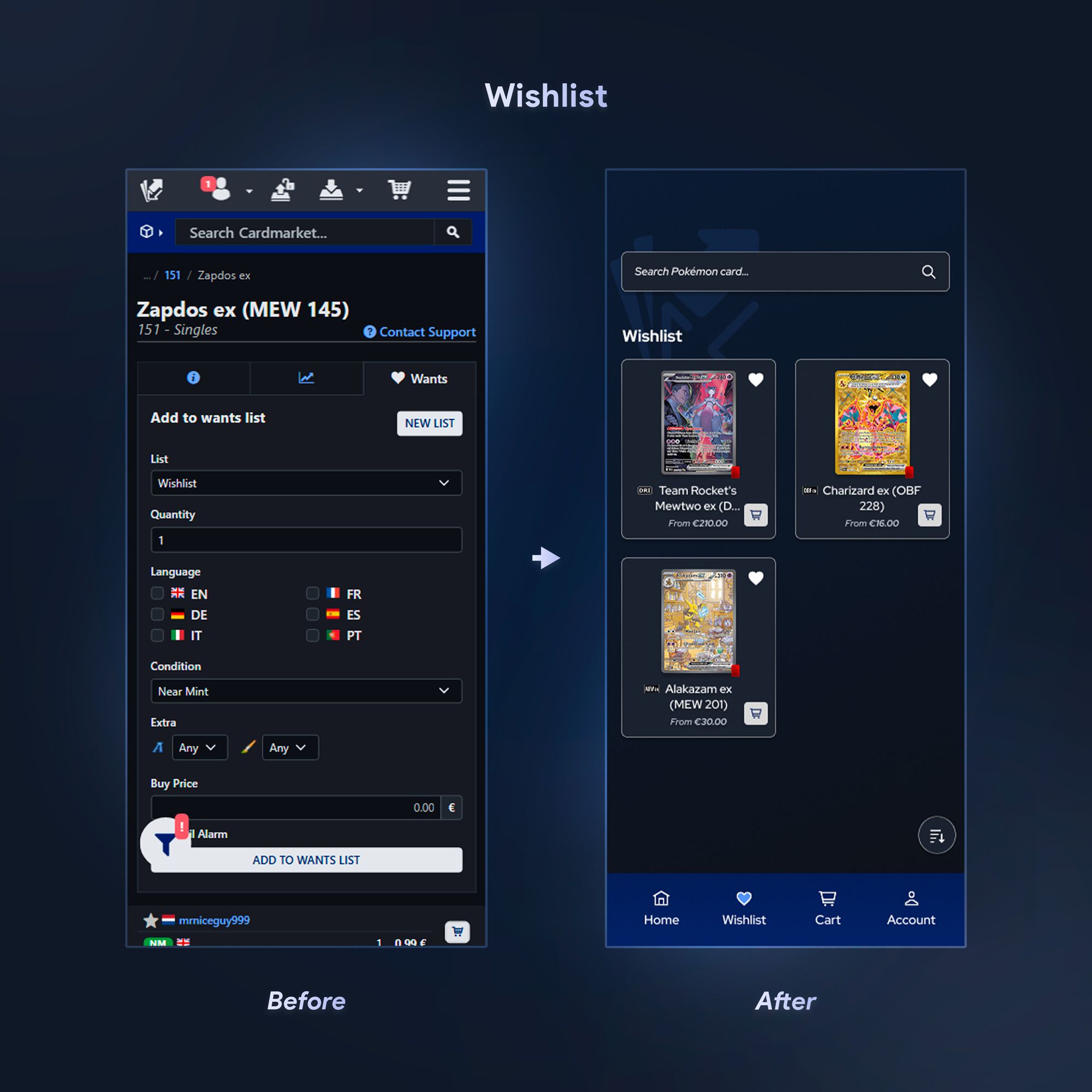
Adding a card to your wishlist takes too many steps: condition, quantity, language and more.
Collectors needed a faster, more convenient way to browse, compare and save cards on their phone.
From sketches to structure
I sketched several layouts to simplify searching and to make the filter section cleaner and less cluttered.
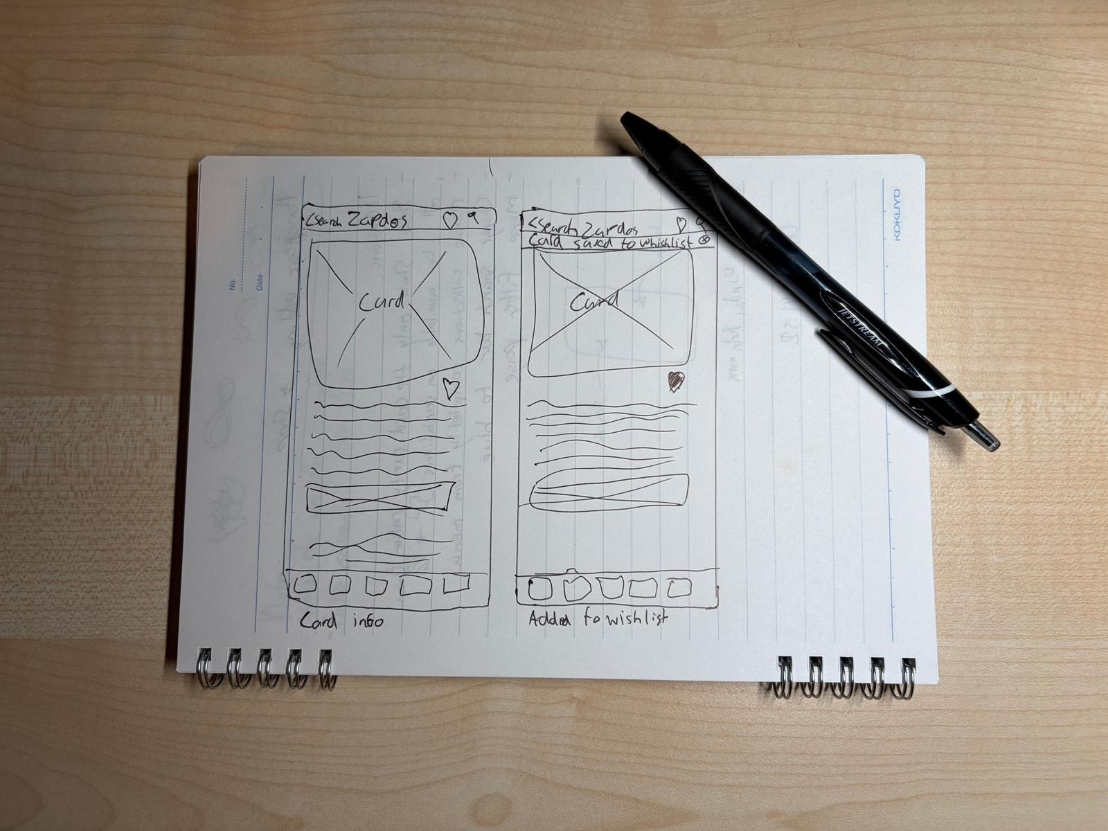
One flow that matters most
I turned the strongest ideas into low-fidelity wireframes to validate structure and layout before any visual design.
The survey pointed to one main flow, so that’s where I focused: homepage, search, card details, filters and adding a card to the wishlist.
Design decisions
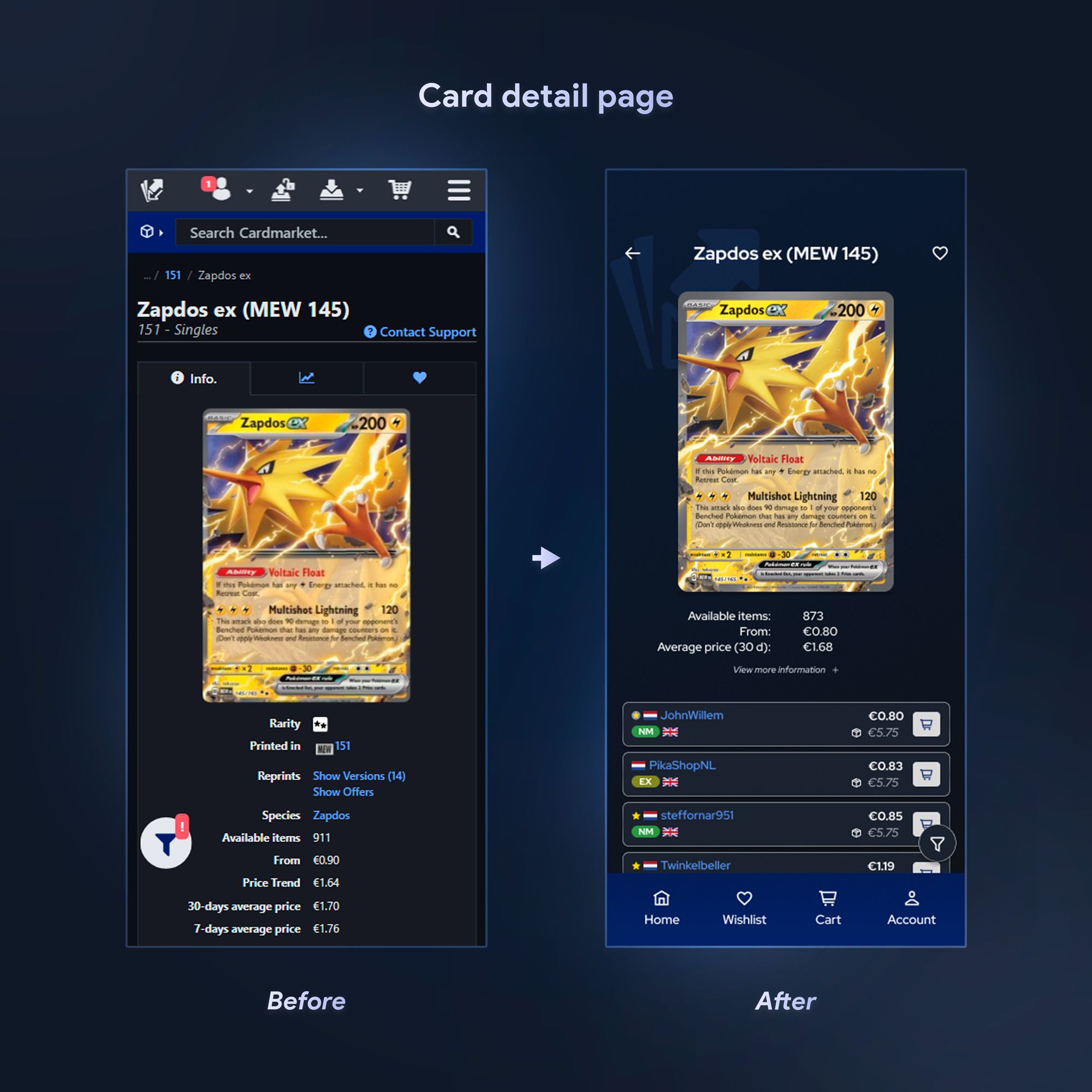
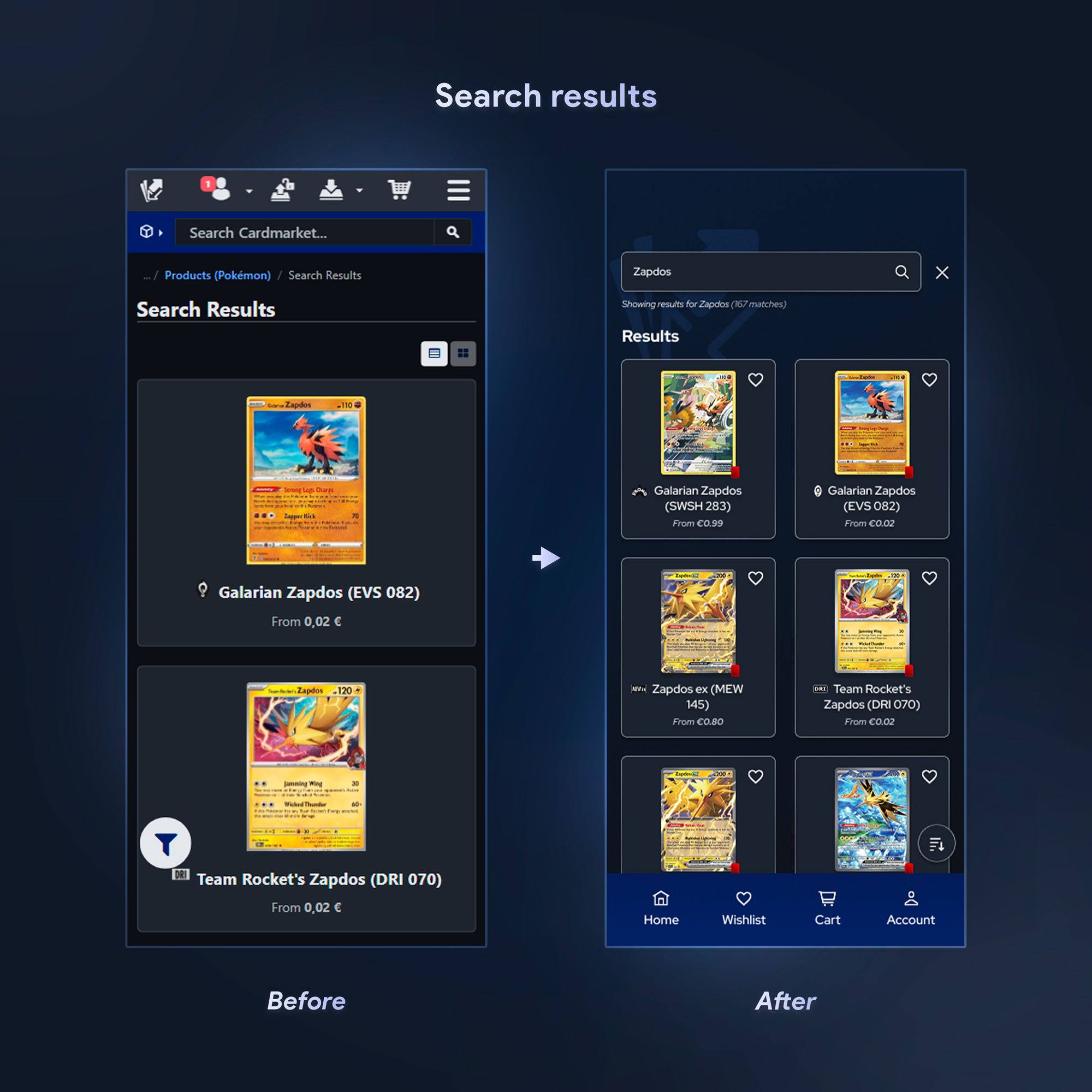
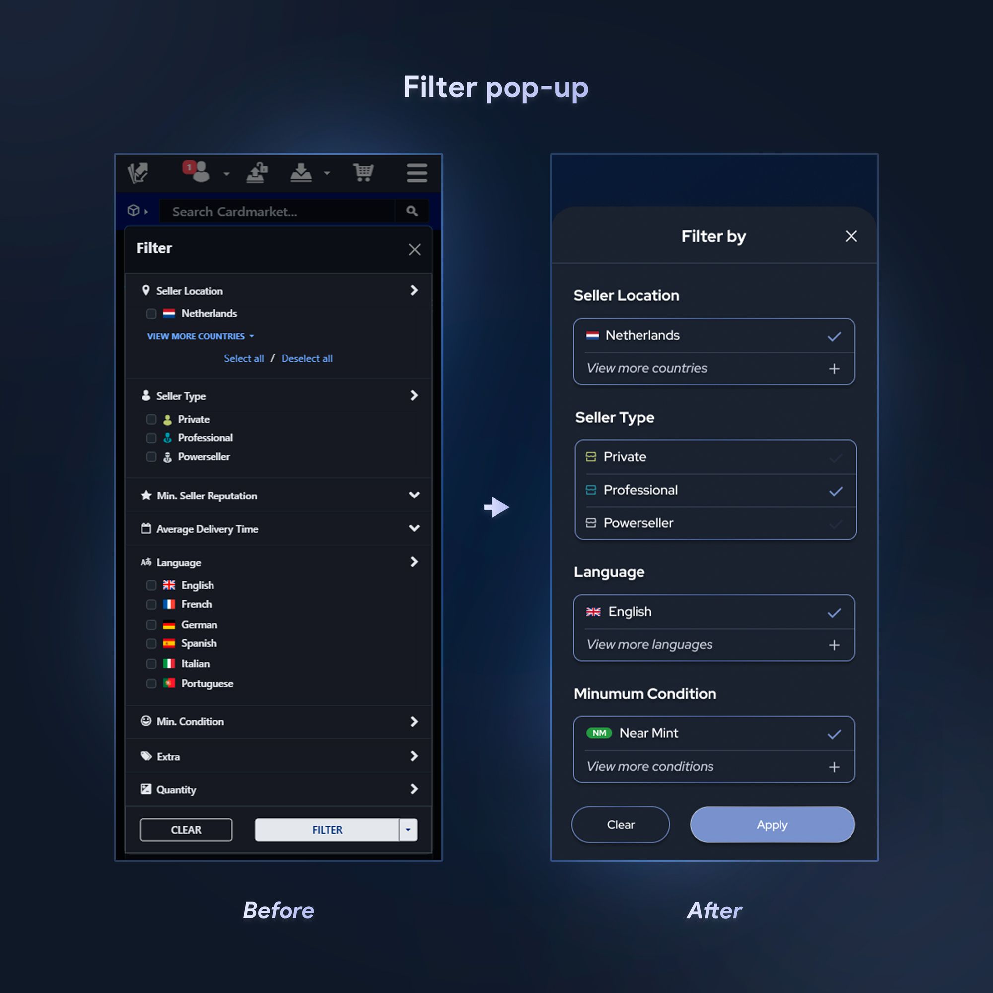
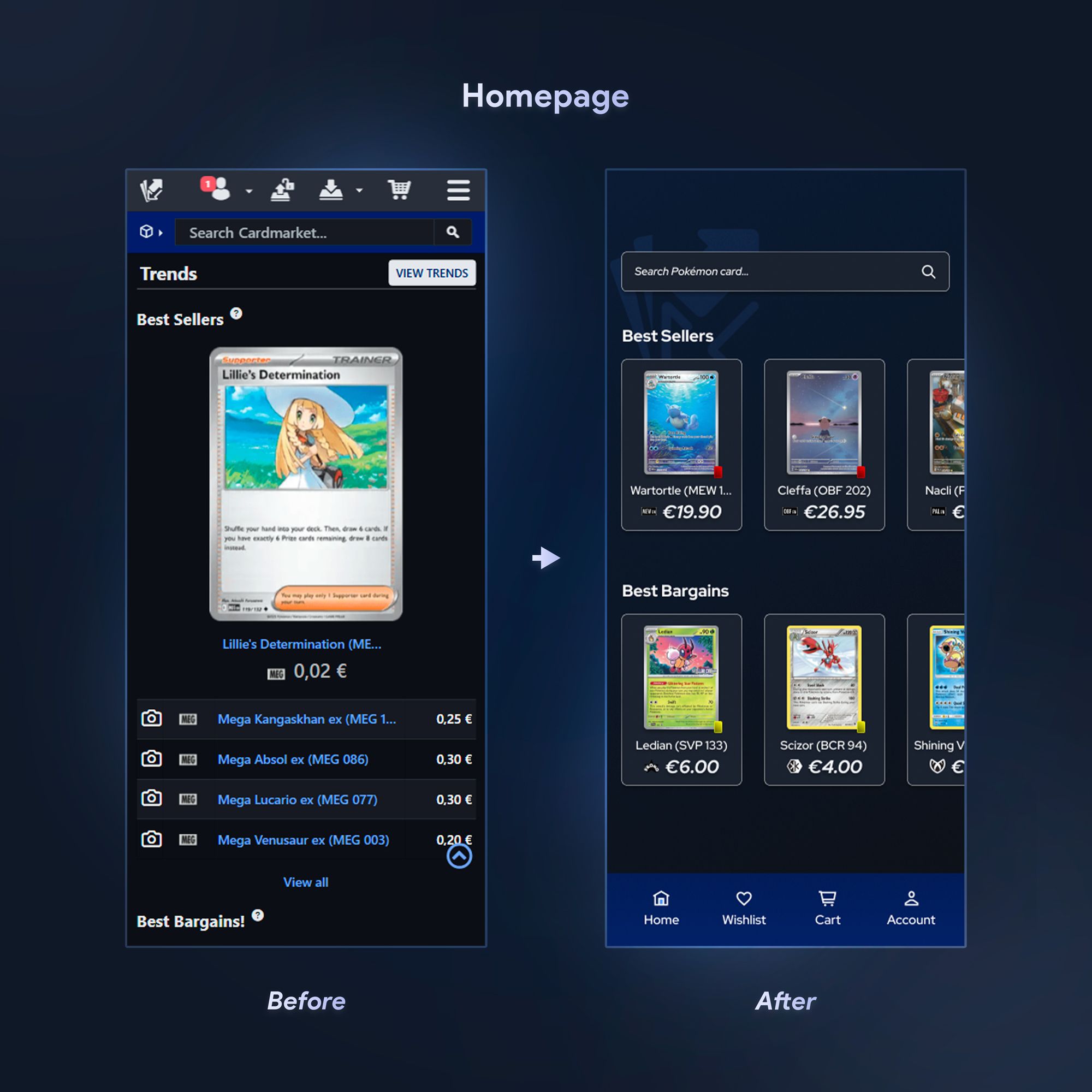
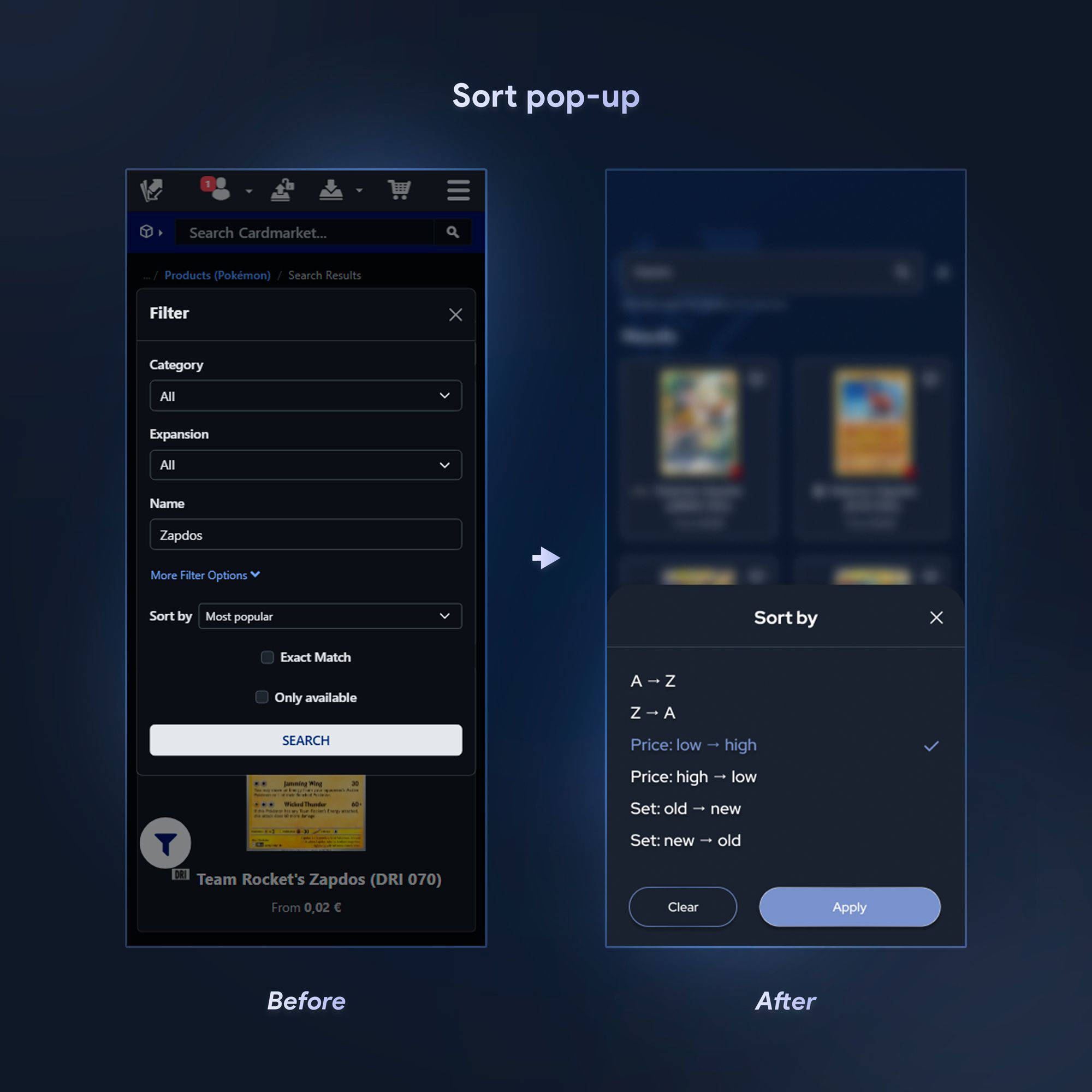
Most changes respond directly to a pain point from the research. Each image compares the current mobile website (left) with my redesign (right).
Filters that remember you
The filter pop-up was cluttered, and picking your preferred language every time was an unnecessary step.
I removed filter options that added clutter and made the pop-up show your last used filters first. Everything else is one tap away under “view more”.
The result
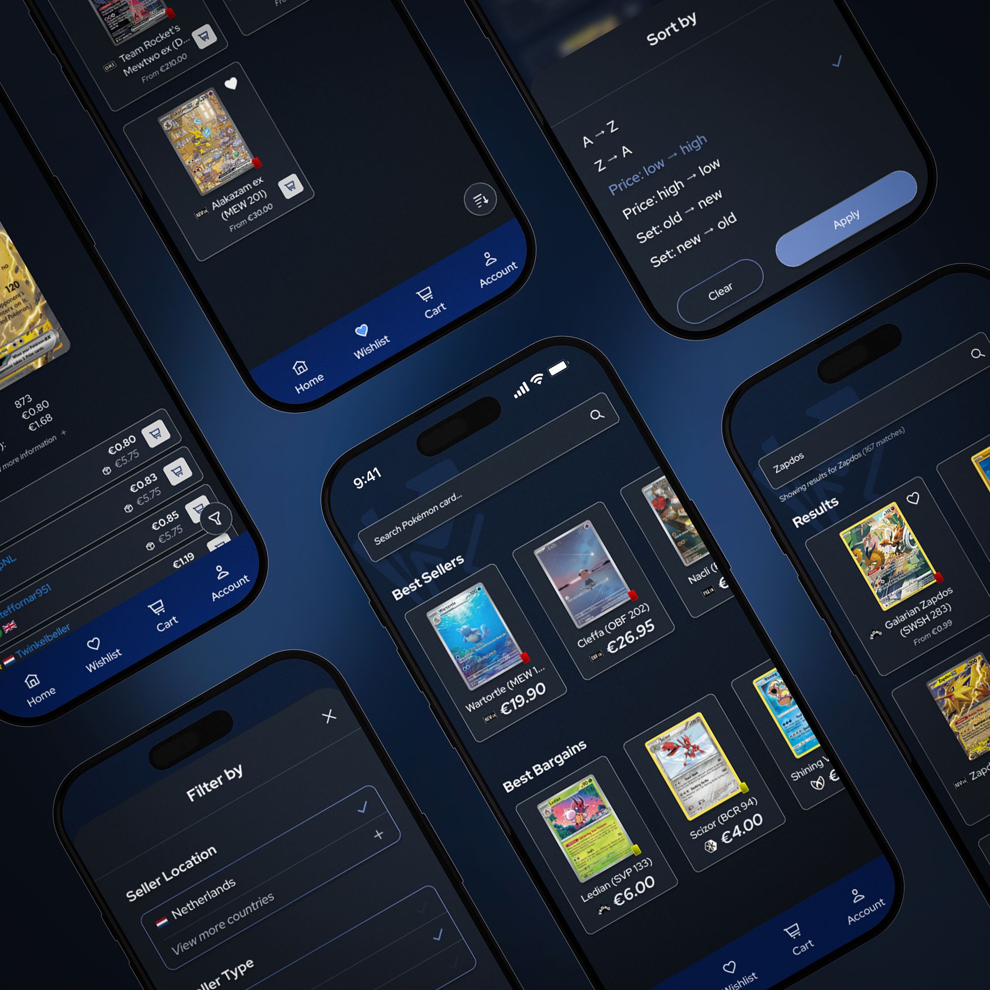
The concept removes steps from the tasks collectors repeat most: the three cheapest listings appear without scrolling, shipping costs are visible before checkout, saving a card takes one tap and previous filters can be reused.
These are design decisions based on the research. The concept hasn’t been tested with a wider group of collectors yet; that would be the next step.
Reflection
Being a collector myself made this project personal, and it made the users easier to relate to.
- 01
Research into decisions
I based most of the solutions on the research, and got better at connecting insights to concrete interface decisions.
- 02
Where the friction is
Most improvements remove only a step or two. On tasks collectors repeat every day, those small steps are exactly where the friction sits.
- 03
What’s next
User testing with more collectors, and the features I left out of scope. At the time of writing, I was discussing development options with an app developer.