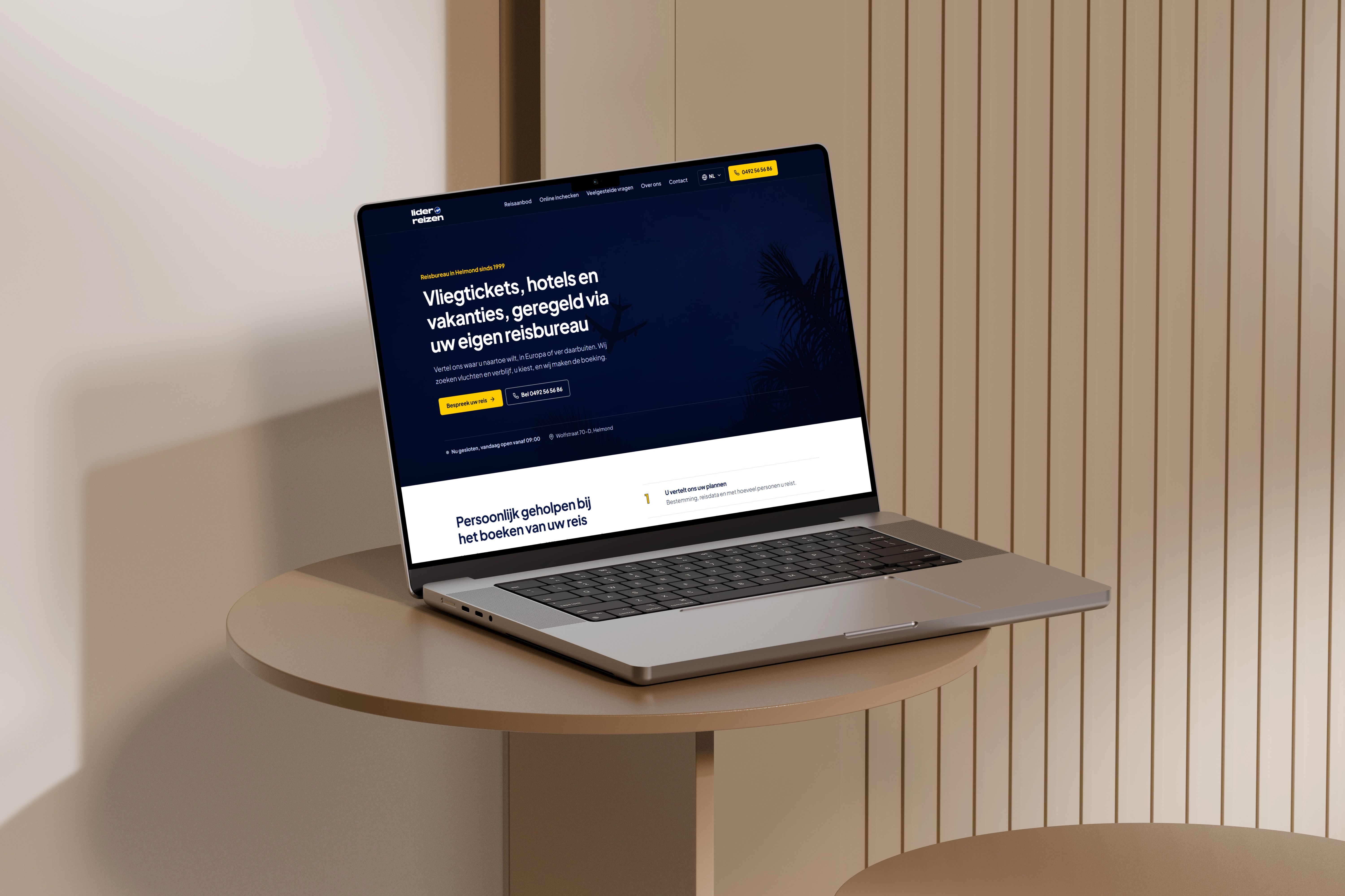
A website for Lider Reizen, a travel agency in Helmond. What began as a landing-page redesign, I turned into a complete, responsive website in 2026.
Where it started
About three years ago, Lider Reizen wanted a clean, modern landing page and a refreshed brand identity that felt more professional. I designed a new logo and a landing page in Figma, working with a stakeholder from the agency and gathering feedback from users.
Each version was reviewed with them. Their feedback was about contrast, spacing and making it obvious that this is a travel agency, and the design changed with every round.
Coming back to it
A landing page only shows a first impression. A travel agency’s website also has to explain its services, answer practical questions and make it easy to get in touch, so I didn’t want to leave it as a single-page design.
In 2026 I returned to it and designed and built a complete website instead: pages for the travel offer, online check-in, frequently asked questions, the agency itself and contact, in Dutch, Turkish and English. The identity from the original redesign carries through all of them.
Design decisions
The homepage says what the agency does in one sentence, with two clear next steps: discuss your trip, or call. The phone number stays visible in the navigation, so calling the agency is always one tap away.
Travel information is kept short and readable, and the same colors, type and components return on every page, so the site feels consistent from start to finish. Every layout works from phone to desktop.
Built with AI assistance
I implemented the website with AI assistance. I was responsible for the design direction and the structure, and I evaluated each iteration, adjusted what didn’t work and made the final decisions.
Reflection
Returning to a project after three years made my growth visible. The original redesign taught me how much contrast, spacing and the weight of a button shape how professional a brand comes across. This time, the challenge was keeping that clarity across a whole website instead of a single page.